Help Page
Shine is a French neobank built for freelancers and entrepreneurs — offering a professional account, invoicing tools, and dedicated support in a single mobile app.
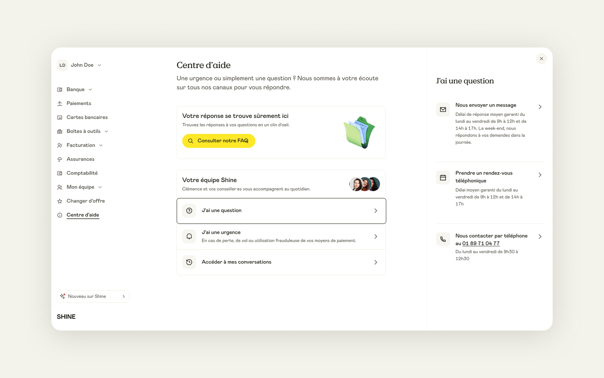
We have decreased contact rate by improving Help Section.
Shine has always focused on providing a seamless experience which involve building a first class support for clients. To do that, we wanted to reduce low value conversations in order to be more efficient and reactive on the ones that really matter.
In other hand, studies show that the fear of losing human contact is one of the main reason to not open an online bank account as an entrepreneur.
Therefore we wanted to increase humanization in order to improve client's satisfaction rate.
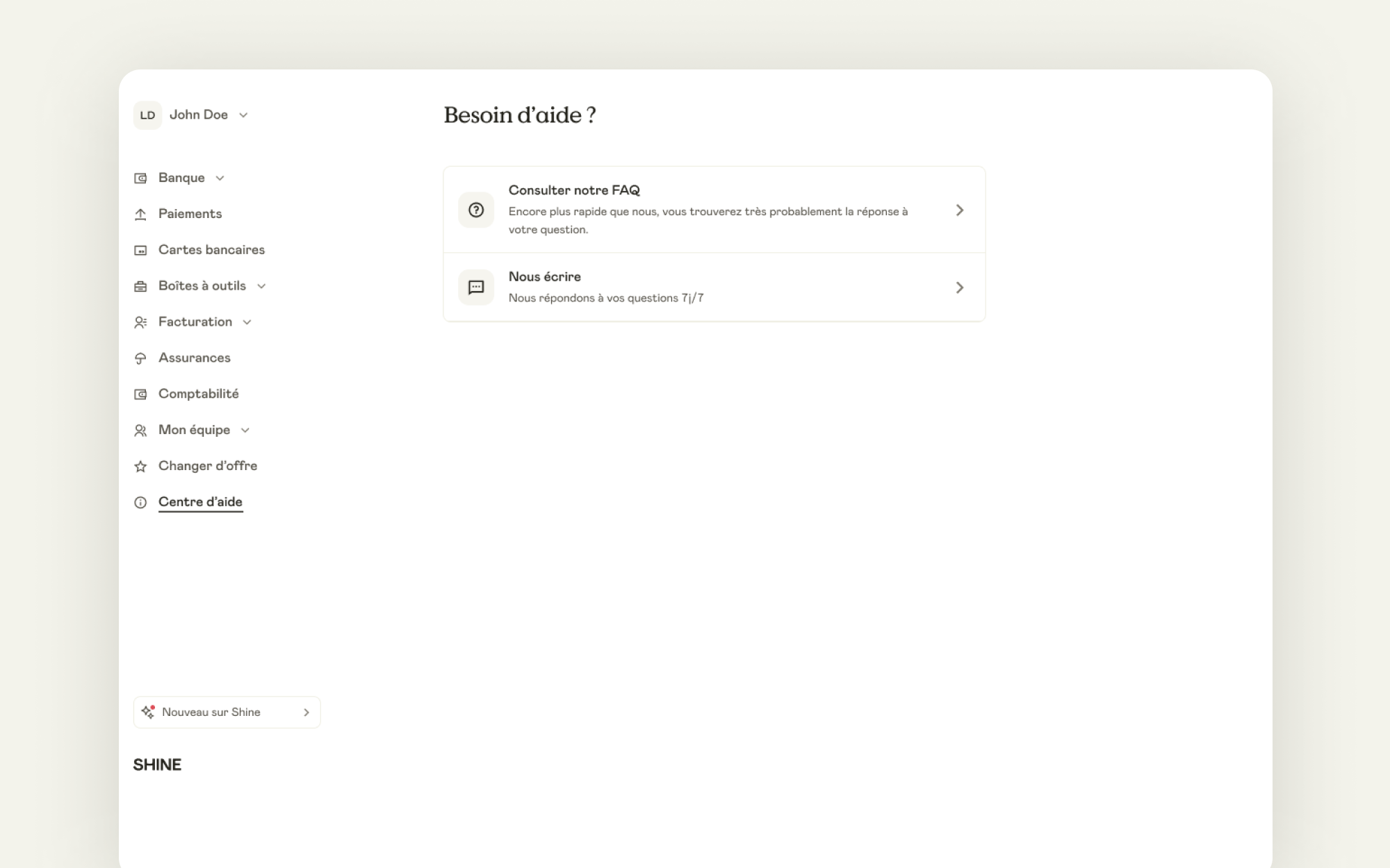
The initial help page gave users two choices: searching the FAQ and talking to Customer Support, no matter the urgency level of their request. Both options were given equal visual weight. This resulted in a large number of Intercom tickets, some of which could have been avoided in our opinion.
As we wanted to decrease low-value conversations, we thought the FAQ should be more prominent in order to push users to find answers on their own before contacting support.
In the meantime, as we wanted to increase humanization in order to increase the satisfaction rate, we thought this page was too minimalistic: nothing was really catching attention.
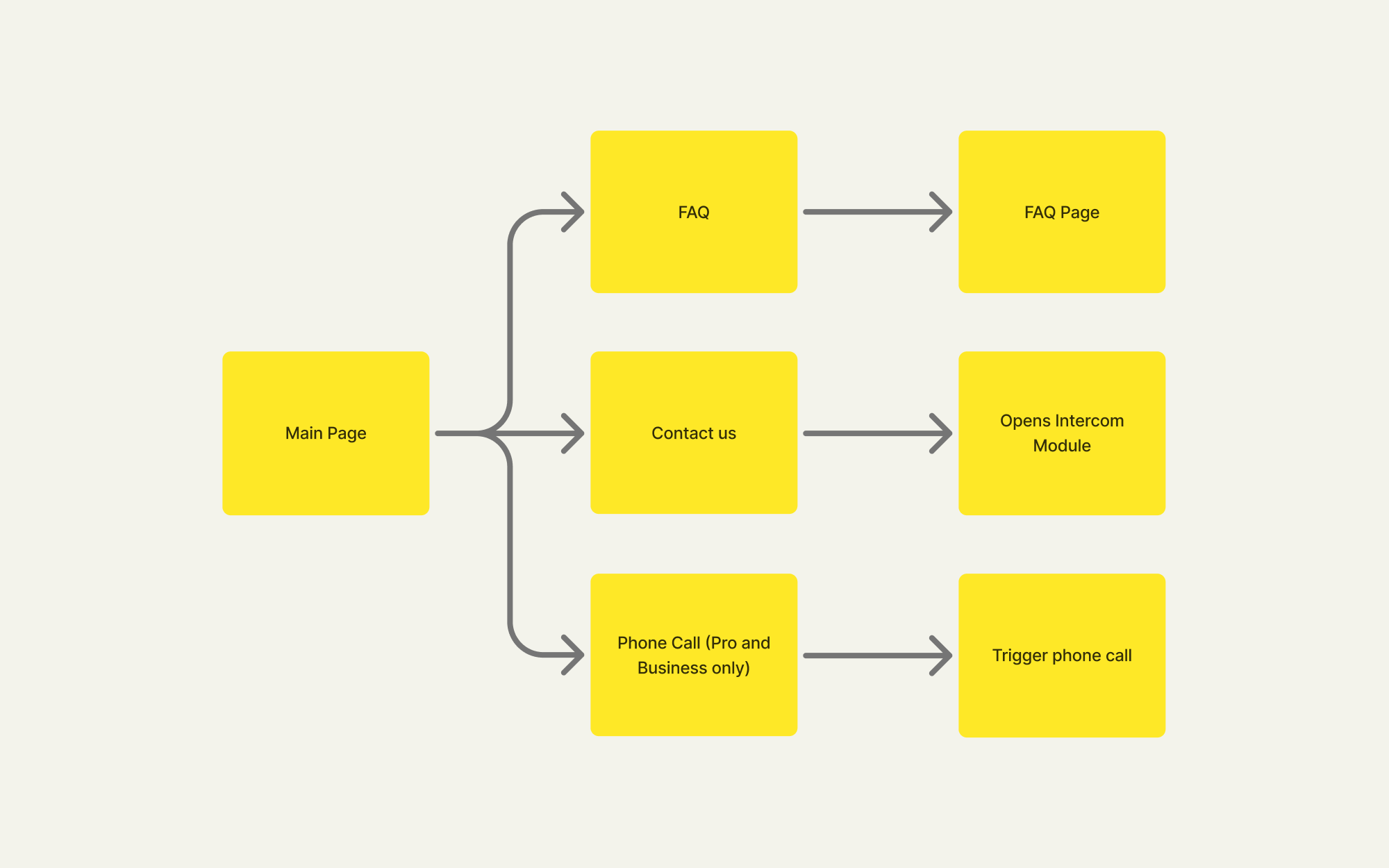
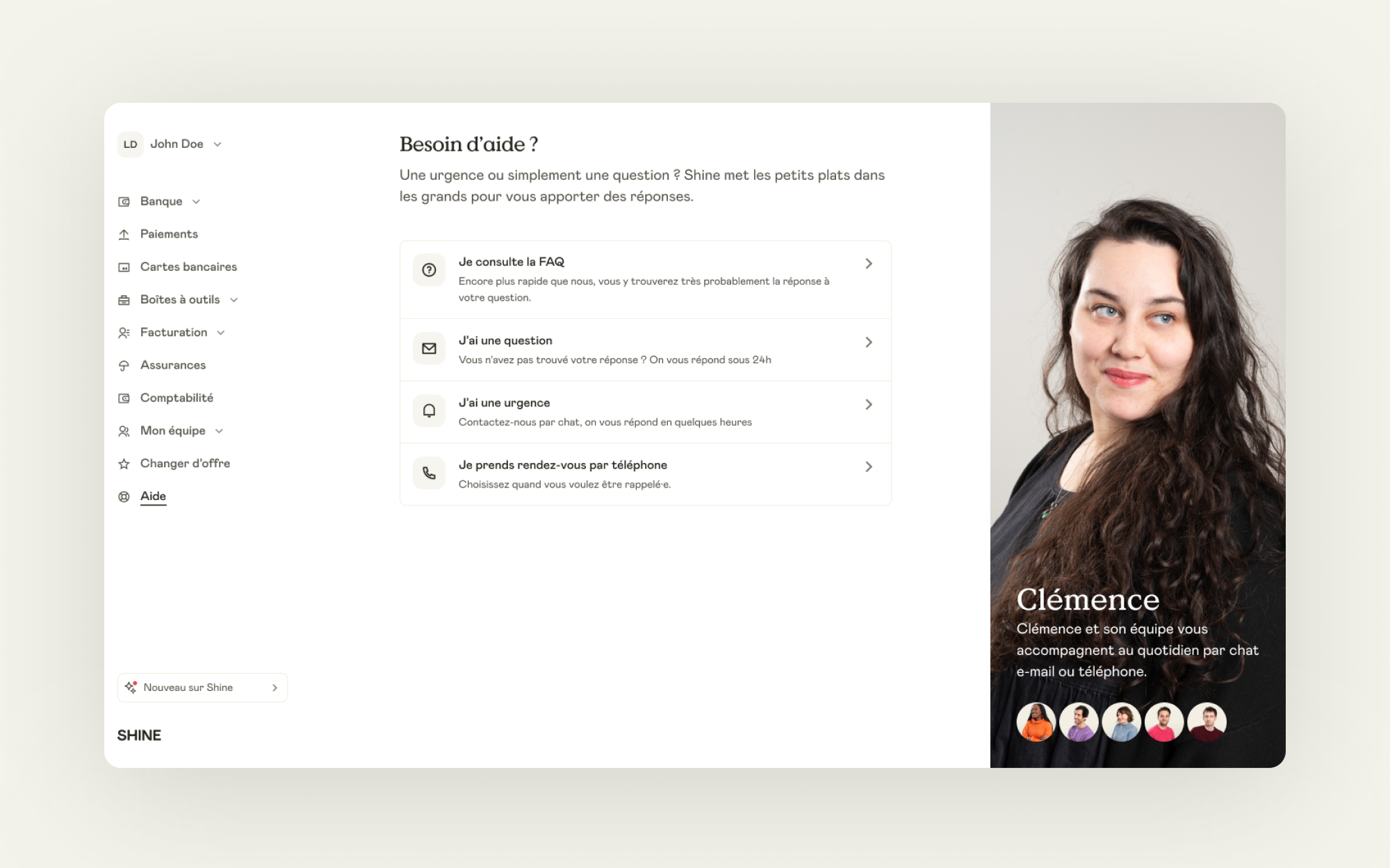
Initial flow
Users had to dig through the FAQ on their own to find answers, with no dedicated channel for urgent issues versus simple questions. Worse, because the support tool looked like a direct messaging app (Intercom), users expected instant replies, leading to frustration when that expectation wasn't met. Also there was no way to find past conversations.
Initial user interface
From interface design perspective nothing was really eye catching. The page wasn't guiding the user at all.
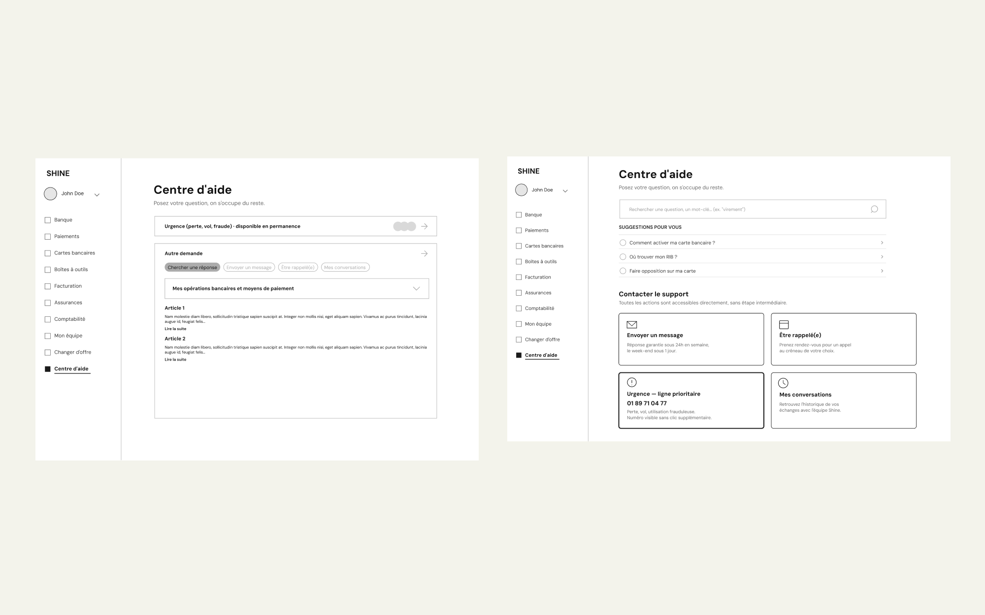
Zoning
The zoning / wireframing phase helped me find the best way to build the page, keeping in mind that users should be able to find their answer by their own.
Ideation
Since users were truly concerned about talking to real humans, I thought about celebrating customer support as human being, but this version has been rejected for security reasons.
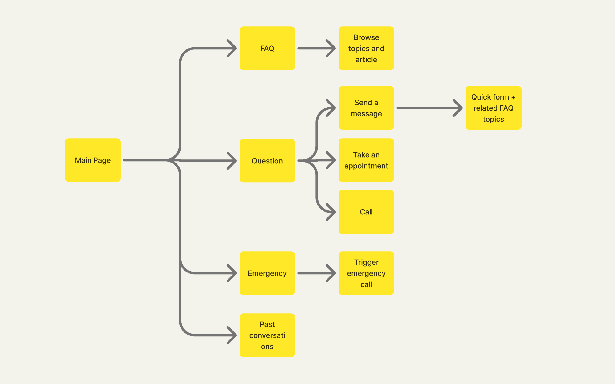
Final flow
The new flow guide users having a question, depending of the level of emergency, helping them finding an answer before actually reaching support.
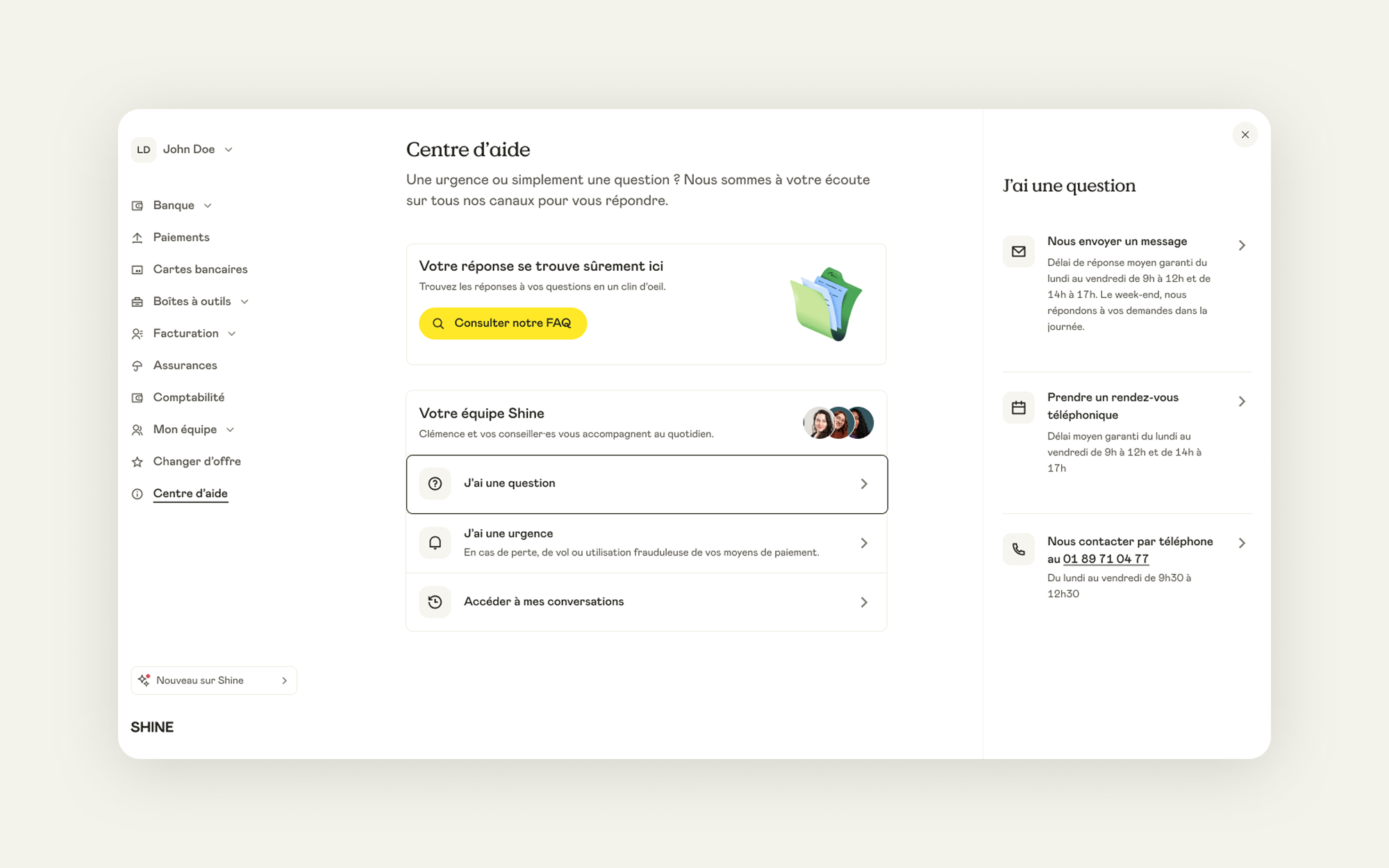
Final version
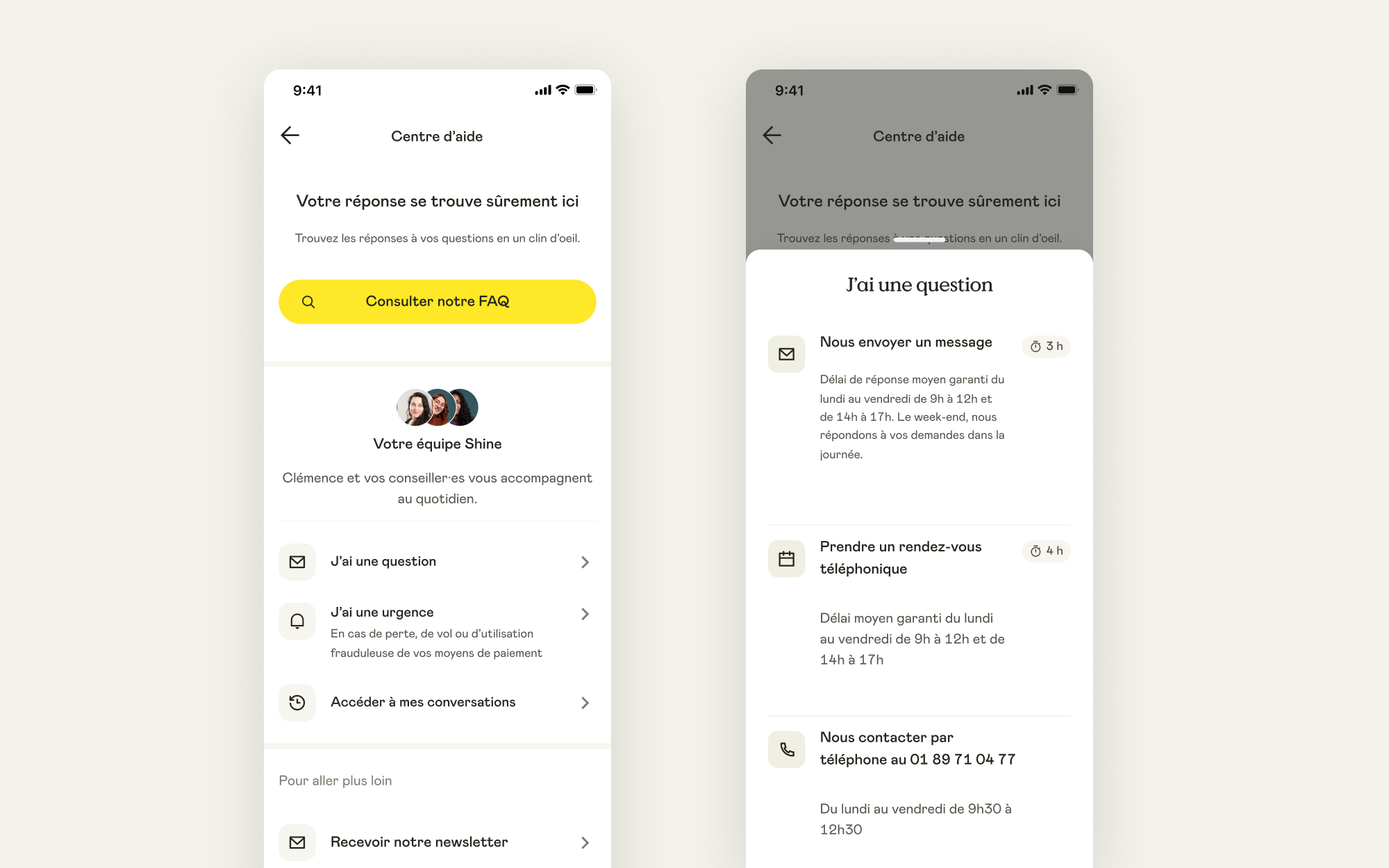
In the final version the yellow primary CTA visually invites clients to browse the FAQ before actually reaching Client Support. Depending of their urgency, clients can either send a message, take an appointment or directly call the Support.
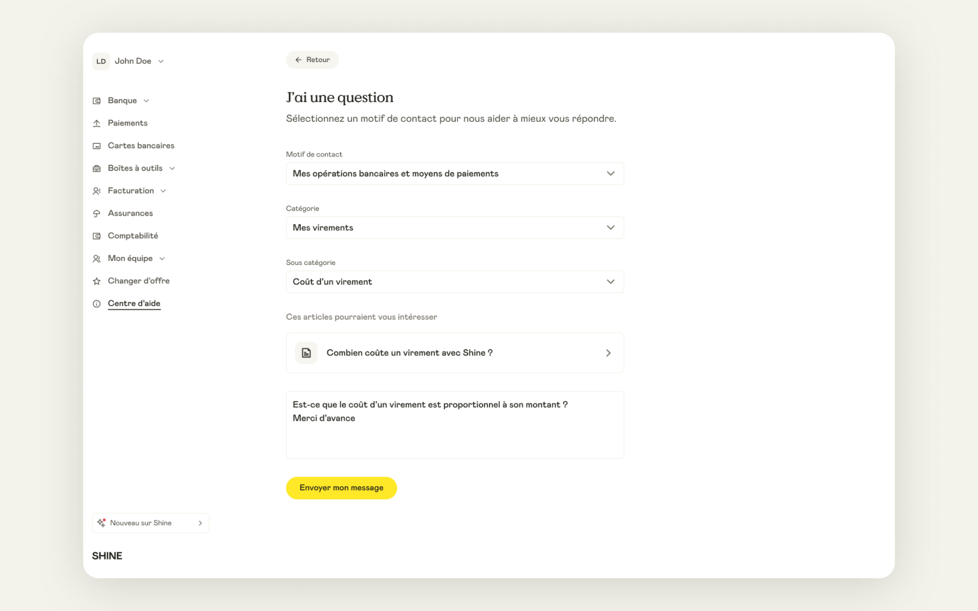
Dedicated FAQ
We have also added FAQ articles links related to the client's question directly in the Sending Message flow.
Mobile version
While more than half of users use the Shine's mobile on a daily basis, the new flow is also available on mobile.
This project helped decrease Intercom tickets by 3 to 4% in the few months following the release. It also increased the Customer Support satisfaction rate.
Please note that these projects are highly confidential and might be still work in progress.
Thanks for not sharing.


