Renter Page
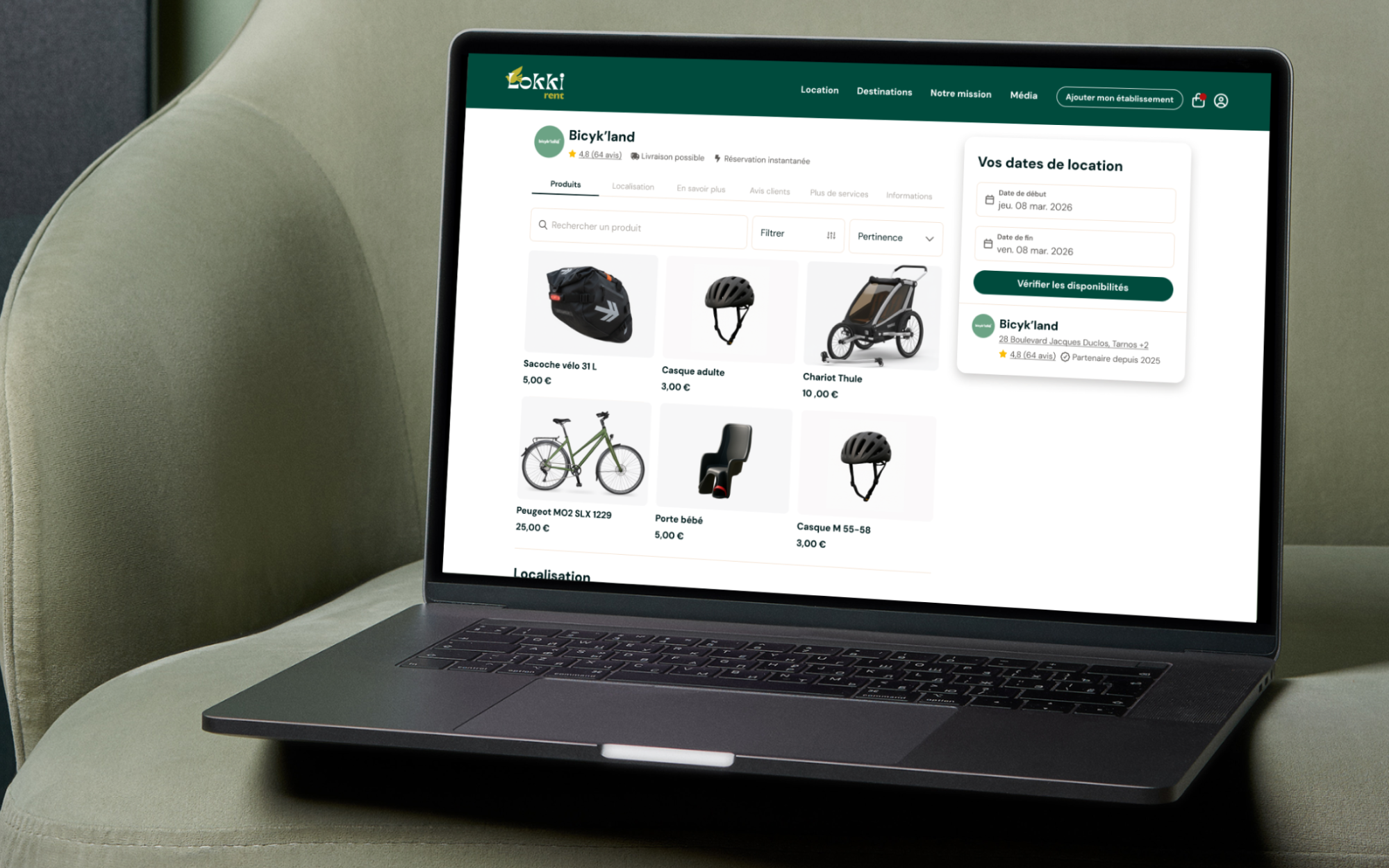
We have revamped renter's and product's page to display truly important informations and increased both number of items added to basket and conversion.
Context
In early 2025, Lokki shifted its strategy. We identified that the Rental Place, where people can discover renters and book products from them, was a stronger opportunity for the company's growth and revenue than the SaaS MRR model.
However, the Rental Place was far from being a real marketplace. Compared to references like Airbnb, Getaround or Tripadvisor, the experience was lacking.
So we decided to redesign one of our most important traffic sources: the renter page.
Approach
After several hours spent on session replays and interviews, we got a clearer picture of what was wrong: users quickly want to see products and prices, know where the renter is located, and whether they can be trusted (user reviews were the number one priority).
We then spent some time understanding the layouts and patterns of the most successful marketplaces, and we started to craft what would become our new renter and product pages.
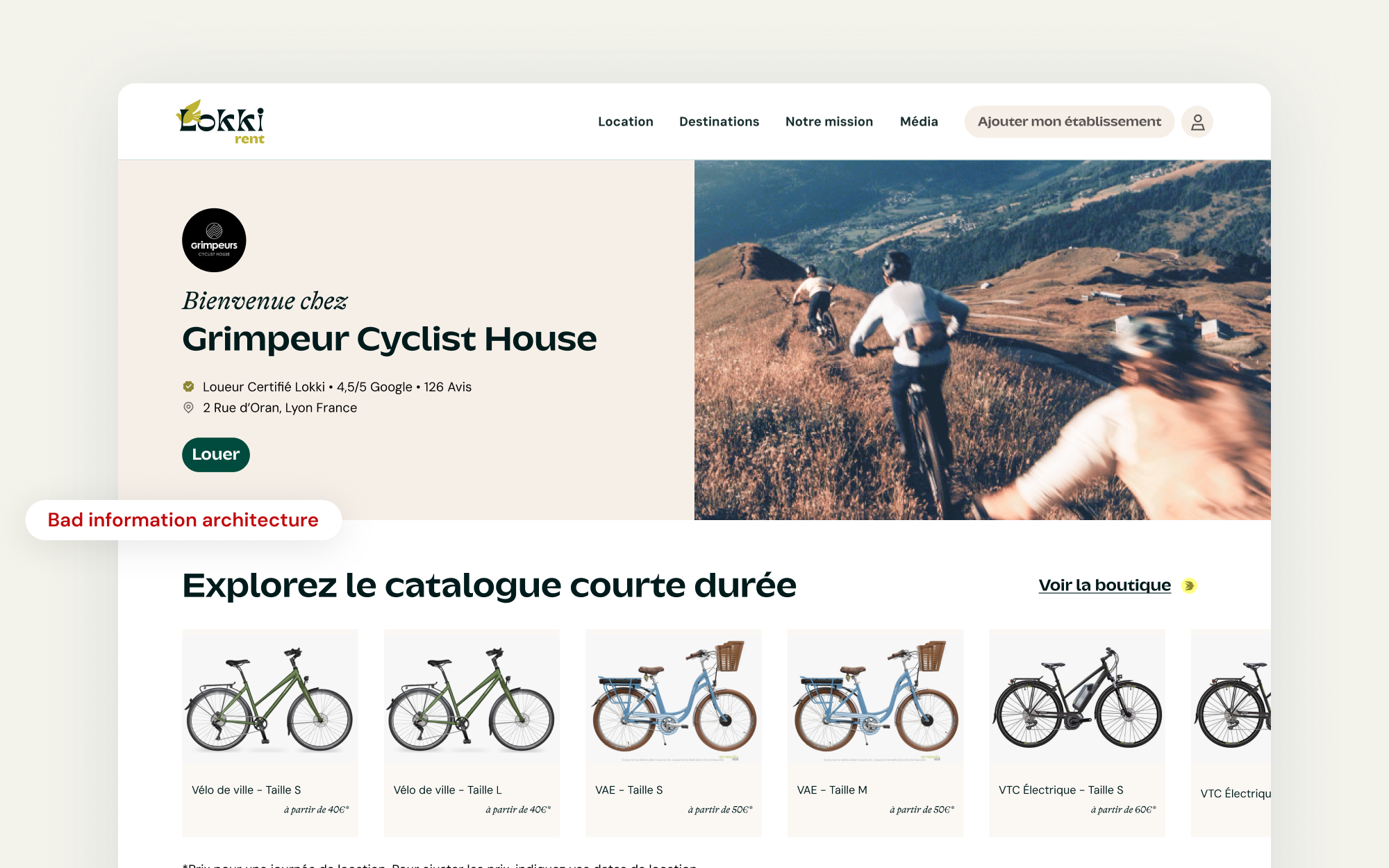
Initial implementation: all important information was either hidden or absent. Everything was huge (pictures, typography etc.)
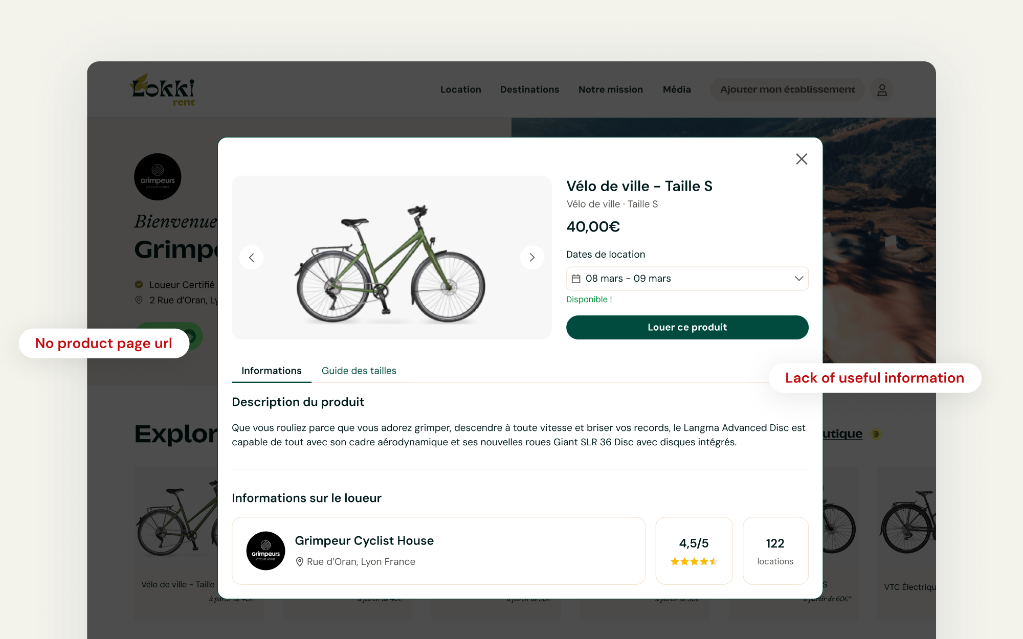
We didn't even have a proper product page. That was a missed opportunity from SEO perspective.
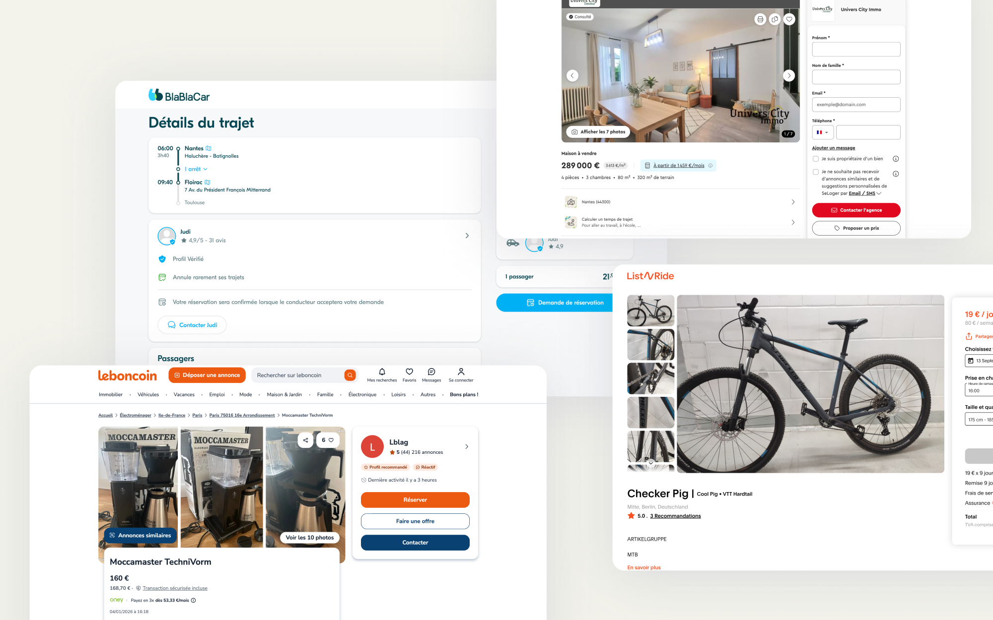
We spent several hours benchmarking marketplaces best practices
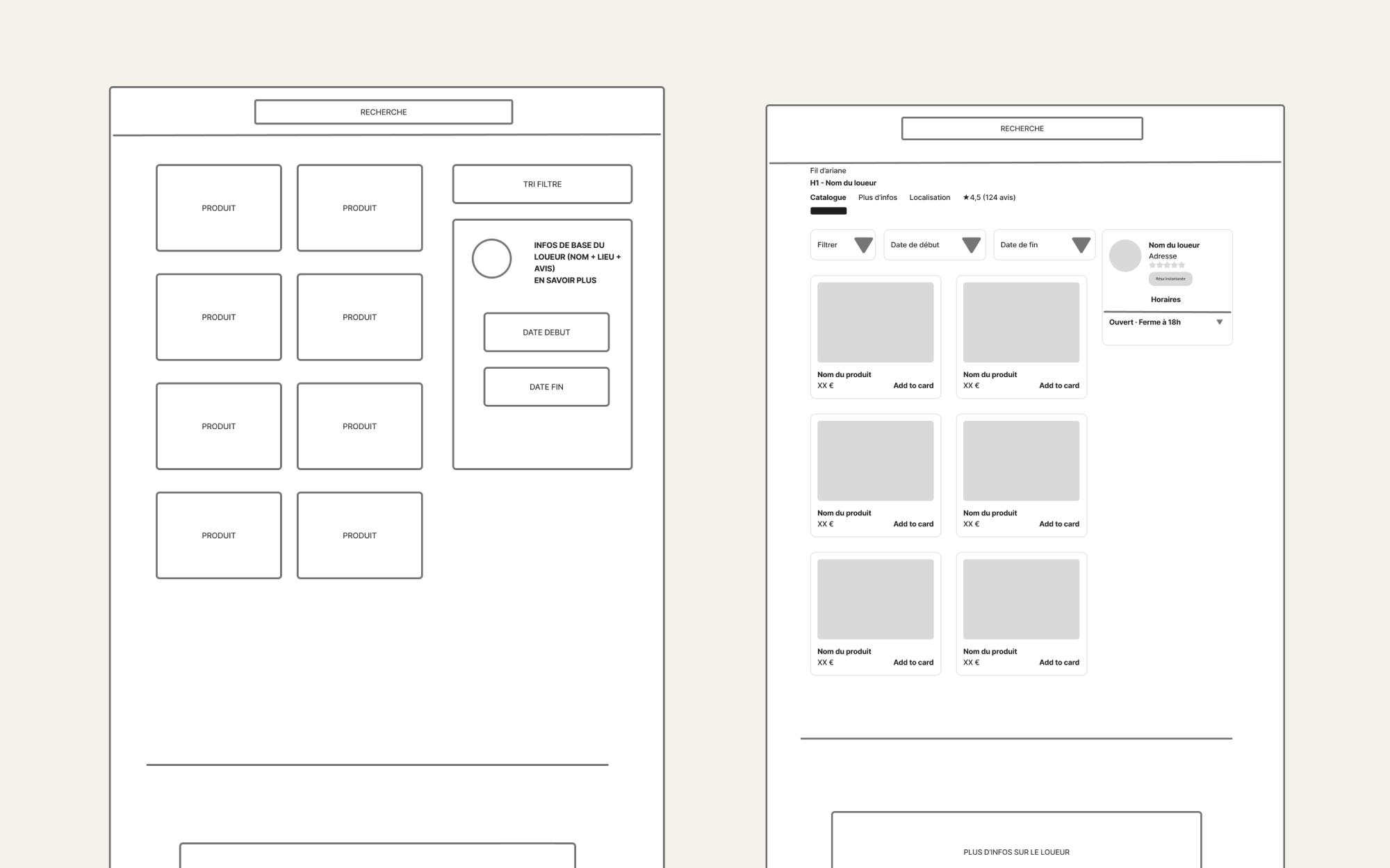
From there, the first layout and structure then took shape.
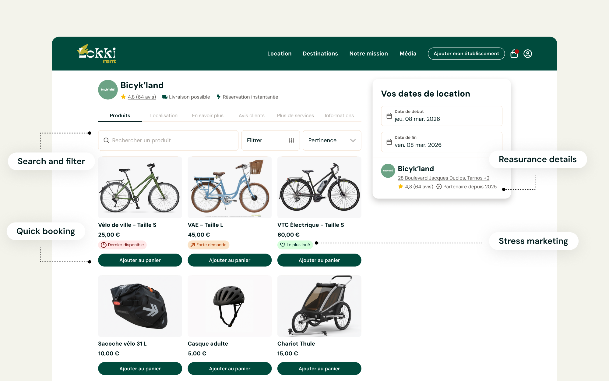
On the renter page, several elements and details improved the experience: products grid structure, search, filter, quick booking CTA and reassurance information.
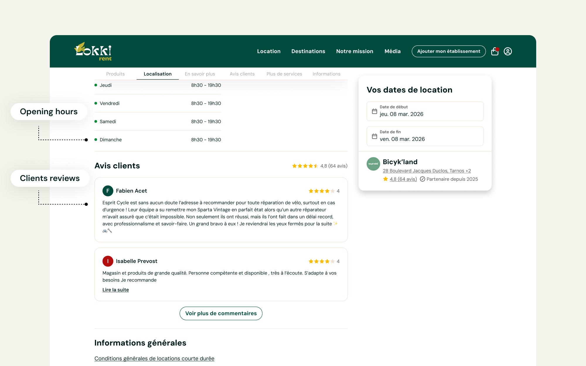
We also displayed clients reviews, which was a crucial element for trust (Especially within a marketplace you don't know)

Since most of our users rent during their vacation, it was important to show where the renter is located.
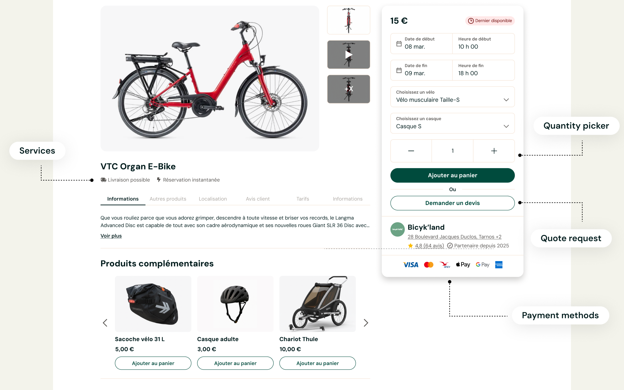
User research showed us that several option like delivery and instant booking was something that mattered for our users.
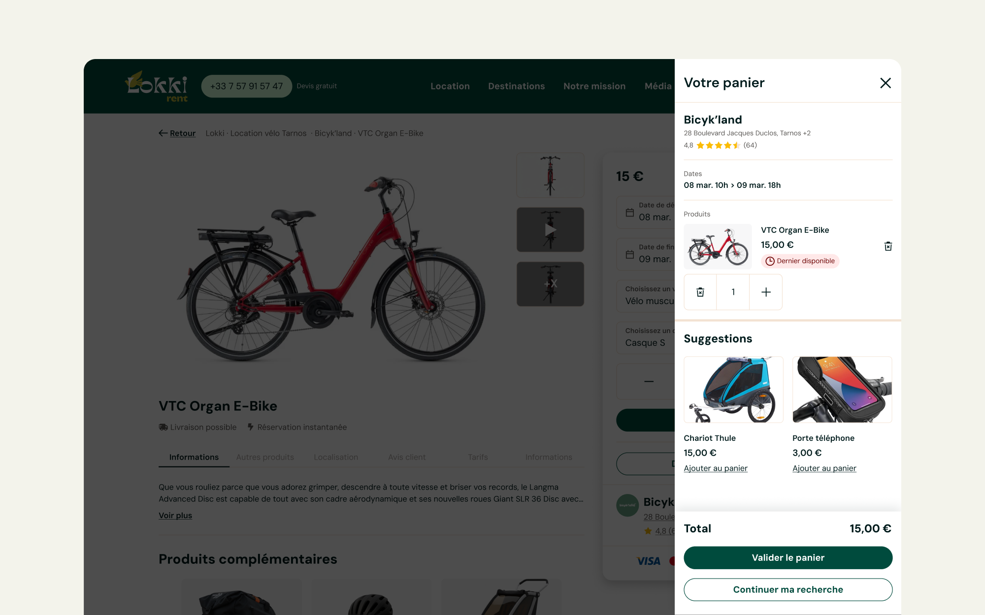
Last but not least, we built from scratch a cart feature, a crucial step for Lokki to reach marketplaces standards.
Outcome
After a few days of A/B testing, then a full 100% rollout, the success was obvious: we increased the number of items added to the basket by 17%.
We also increased traffic on the Rental Place by turning the product modal into a real page, which had a positive impact on SEO.
Please note that these projects are highly confidentials and might be still work in progress.
Thanks for not sharing.


